
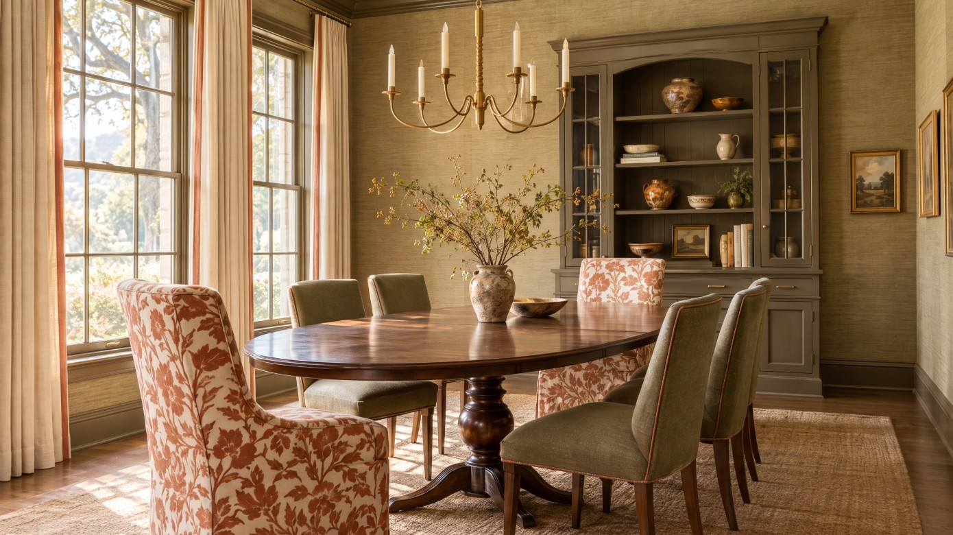
An illustration of the dining room described in this post.
I asked a friend recently whether she shops at a store where many people she knows have furnished their homes. She said no. Not because of price, and not because of quality. Because everyone’s homes were starting to look the same.
That observation is worth sitting with, because it describes something structural rather than accidental. When a home is furnished largely from one retail showroom floor, the store’s inventory becomes the design. The sofa, the case goods, the lighting and the art were chosen by one buyer, for one season, for a general audience. The rooms turn out pleasant. They also turn out similar.
The alternative is not a bigger budget or more daring taste. It is a different method. We specify through trade-only showrooms and the wider trade market rather than a single retail floor, and we build a palette before we buy anything. That is how two families with similar homes on similar streets end up in rooms that could never be swapped.
The direction many of our clients are drawn to right now is what we call The New Traditional Home. It borrows from the Carolina traditional rooms of the South: calm color used at a deeper saturation, pattern that is layered rather than scattered, and painted architecture that does real work. It is warm and it is composed. It is not beige, and it is not a museum of antiques.
Three decisions carry most of that character: wallpaper, trim paint and upholstery.
The method: hold the undertone, move the value
Most rooms that feel busy are not suffering from too much color. They are suffering from too many undertones.
A warm olive, a soft clay, a warm ivory and an inky brown can all live together at full strength because they share a warm base. Introduce one cool gray-blue into that group and the room stops resolving. Each color is lovely on its own. Together they feel unsettled, and the homeowner usually concludes they should have played it safe.
The New Traditional palette works by holding the undertone family constant and varying two other things instead: value, meaning how light or dark each color sits, and scale, meaning how large each pattern is relative to the others. That is what allows color to be saturated and still read as calm.
The paint industry has moved in the same direction. For 2026, Benjamin Moore named Silhouette AF-655, a rich espresso with charcoal undertones, as its Color of the Year, and Sherwin-Williams named Universal Khaki SW 6150, a warm, grounded neutral. Both sit a long way from the cool grays that dominated the previous decade.
Wallpaper: the fastest way to give a room a point of view
Wallpaper is the most efficient way to give a room a point of view. It is also the decision most often made backward: someone falls in love with a pattern on a screen and then goes looking for a wall to put it on.
We work in the other order.
Choose the room first. The rooms that reward wallpaper most are the ones you pass through or occupy briefly and intensely: a powder room, an entry, a stair hall, a dining room ceiling, the back of a bookcase. A small room can carry a pattern that would exhaust you in a family room.
Then match the scale to the architecture. Many homes in Granite Bay, Roseville and El Dorado Hills were built with two-story entries, tall stair halls and generous volume. A small repeat disappears in that space and reads as texture from ten feet away. A large repeat that looks bold on a sample often looks exactly right across fourteen feet of wall.
Then confirm it on the wall. We ask for the largest sample the mill will provide and look at it vertically, taped to the actual wall, in that room’s light, at the hours the room is used. Sacramento Valley afternoon light is strong and warm, and west-facing rooms in particular pull yellow late in the day in a way no showroom can show you.
A few things we settle before anything is ordered, because this is where wallpaper projects go wrong:
- Yardage is calculated from the pattern repeat, not just the wall area. A large drop-match repeat can use noticeably more material than the square footage suggests.
- The whole job is ordered from one dye lot, with extra, at the same time. Matching a lot later is often impossible.
- Wall preparation is part of the specification. Orange peel and knockdown textures show through paper. A skim coat or a liner is often the difference between a wall that looks tailored and one that looks bumpy. Rounded bullnose corners, common in homes built in this region, also change how a pattern turns and ends, and that needs planning rather than improvisation.
- The installer is half the result. We budget for someone who hangs paper every week, not occasionally.
- Grasscloth has natural variation in color and at the seams. That is a characteristic of the material, not a defect, and clients should see it and accept it before ordering.
Trim paint: the decision almost no one makes on purpose
Trim color is usually inherited rather than chosen. The builder used a bright white, and every decision after that was made around it.
That default works against a New Traditional palette. Bright white trim against a saturated wall draws a hard outline around every door, window and baseboard, and it chops the room into pieces at exactly the moment you are trying to make it feel whole.
Two approaches work better.
Take the trim deeper than the wall. A warm putty, a soft mushroom, a muted green, or black on a stair rail gives the architecture weight and lets the walls settle behind it.
Or paint the trim the same color as the wall in a different sheen. Walls in matte or eggshell, trim in satin. The room becomes one enveloping surface, and the millwork shows up in the light rather than in contrast. It is a quiet, expensive-looking effect, and it costs no more than any other paint job.
A few practical notes either way. Trim color reads noticeably darker across a long run and in a narrow hall than it does on a paint card. Higher sheens show every flaw in older or wavy millwork, so satin is often more forgiving than semi-gloss. And trim color has to be tested on the trim itself, at a meaningful size, in the morning and late afternoon, next to the flooring and cabinet finish it will live with.
Upholstery: where the color has to be right for years
Wallpaper can be changed in a weekend. Upholstery cannot, and it costs considerably more, so the discipline is different.
In the open floor plans common across this region, the sofa is rarely seen on its own. It is visible from the kitchen, the entry and often the stairs. That is an argument for letting the sofa hold the room’s quieter note in a durable, tonal fabric, and giving the saturated color and assertive pattern to pieces that are easier to live with and easier to change: a pair of chairs, an ottoman, a bench at the foot of a bed, the drapery.
We also vary pattern scale deliberately between neighbors. A small, tight print on a large sofa disappears and quarrels with the wallpaper. A large repeat on a small chair gets cut apart at the seams. Pattern has to be sized to the frame it sits on, and pieces that sit side by side should not compete at the same scale.
What we confirm before specifying a fabric:
- The cleaning code. W, S, WS or X tells you how a fabric can be cleaned. X means vacuum only, which is a serious commitment in a home with dogs or children.
- The abrasion rating, expressed in double rubs. We ask the vendor for the tested figure rather than accepting the word “durable.”
- Lightfastness, which matters more here than in many markets. Strong valley sun will fade an unprotected fabric in a west-facing room, and both drapery lining and fabric selection have to answer for that.
- Whether the fabric is railroaded, which determines whether a long sofa back can be upholstered without a seam.
- The lead time. Custom upholstery is measured in months, and that timeline belongs in the schedule before a single order is placed.
Then come the details that make a well-made frame look designed for the house rather than bought for it: a contrast welt, a tape trim on the leading edge of the drapery, a tailored skirt, a nailhead that picks up a metal already in the room.
What this can look like in one room
Picture a west-facing dining room with ten-foot ceilings. A warm olive grasscloth on the walls gives the room depth and texture without a competing motif. The trim and the inside of the built-in go a shade deeper and warmer than the paper, so the architecture holds the corners. The host chairs are covered in a large-scale print in clay and ivory. The side chairs stay quiet in a woven that picks up the olive, welted in the clay to tie the two together. The drapery is a solid linen, lined and interlined against the afternoon sun, with a narrow tape trim on the leading edge.
Four layers of pattern and texture. One undertone family. Nothing in that room comes off a showroom floor as a set, which is exactly the point.
The part that protects the result
None of this works as a shopping list. It works as a sequence, and the sequence is what a designer is for.
Palette before purchases. Samples confirmed in the room, in the room’s light, at the hours it is used. Dimensions measured, never assumed. Dye lots, repeats, cleaning codes, lead times and installation requirements resolved before money moves. Installers briefed on what has been specified and why.
That discipline is not glamorous. It is the reason a New Traditional room reads as deliberate rather than accumulated.
Frequently asked questions
What is New Traditional interior design?
It is a current take on traditional rooms: classic furniture shapes, layered pattern and painted architecture, with warmer and more saturated color than the gray and white palettes of recent years. The goal is a room that feels personal and livable rather than formal.
What color should trim be with wallpaper?
Rarely bright white. We usually take trim deeper and warmer than the background of the paper, or match it to a color within the pattern, so the woodwork frames the wallpaper instead of outlining it. Always test on the actual trim, in the room’s own light.
How much wallpaper should I order?
It depends on the pattern repeat, not just the wall area. Large repeats require more material. Order the entire job, plus extra, from one dye lot at the same time.
Our next workshop is on wallpaper
We will cover choosing pattern and scale for your rooms, reading a sample correctly, the wall preparation your home actually needs, and how to budget for both material and installation. If you would like an invitation, contact us and we will let you know as soon as the date is set.
In the meantime, you can see recent work in our portfolio. When you are ready to plan a room or a whole house, book a consultation with EvokeInteriorDesigns.com or call 916-510-6603. We will start with the palette.